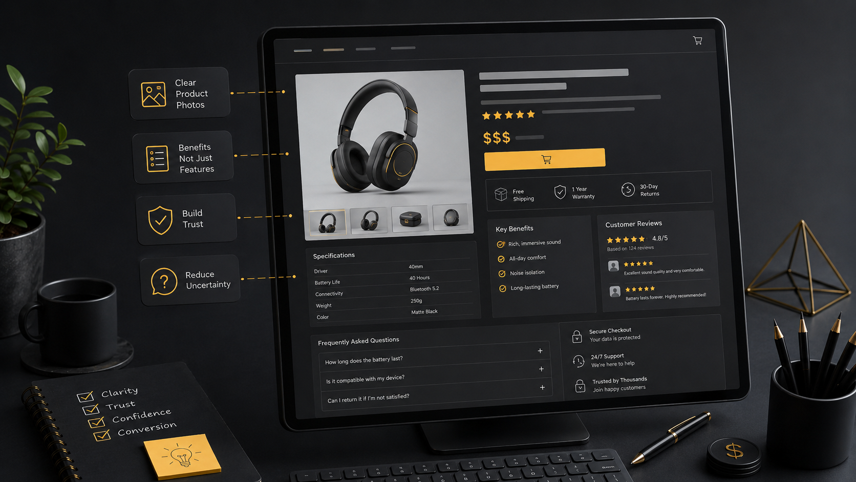
Make the product clear in a few seconds
Visitors usually want to know what the product is, what it costs and whether it meets their needs. An unclear name, a long opening description or a hidden price delays those answers. Use a specific product name that resembles the language your customers use.
Add a short sentence about its purpose or main difference. “Anniversary rose box with same-day delivery in Tehran” gives a customer more useful information than “Special box.”
Use photographs to remove uncertainty
The main image should show the actual product clearly, with good lighting and a simple background. Additional photographs can show scale, details, packaging and use. Close-up images matter when color or texture affects the decision. An attractive but unrelated picture can draw attention while weakening trust.
- Show the real product clearly.
- Keep image proportions consistent across the store.
- Write accurate, natural alternative text.
- Optimize file sizes for mobile loading.
Keep price, availability and delivery near the purchase controls
Customers should not have to search for the final cost or delivery conditions. Show the price, genuine discounts, stock status, delivery area and estimated delivery timing next to product options and the add-to-cart button. Explain shipping charges before checkout if they depend on location or order value.
Even correct information can feel like a hidden charge when it appears too late.
Write descriptions that help people decide
General claims such as “excellent,” “high quality” or “unique” do not explain a product. Describe its material, size, purpose, package contents, care requirements and limitations. Put essential facts first, with more detail further down the page or in expandable sections.
Make variations easy to compare. “12-stem box” and “24-stem box” explain the difference more clearly than “Option one” and “Option two.”
Place genuine trust information where it matters
Return conditions, payment methods, answers to common questions, contact details and genuine reviews can reduce uncertainty. Keep them near the point of decision without covering the page in repeated badges. A few verifiable details are more useful than a long list of promotional promises.
Test the mobile purchase journey separately
Large images, crowded options and small controls can make buying harder on a phone. Customers should be able to select a variation and tap the purchase button comfortably. Check text wrapping, spacing and the complete journey from product page to checkout on several phone sizes.
Let’s discuss your website
Tell us about your products and order process. We can help plan an online store with clear product pages and a manageable shopping journey.
Book a free consultation